


Cream and Beige Sofa Styling: How to Decorate Around a Neutral Sofa
A cream, beige, or sand-coloured sofa is the most versatile foundation a living room can have. Its neutrality is not a lack of character — it is a deliberate, intelligent design choice that gives you total freedom over every other element in the room. Unlike a bold-coloured sofa that directs and constrains the palette, a neutral sofa works with almost any colour story you want to tell. The challenge is not whether it will work — it always will — but how to prevent it from reading as bland or unintentional, and how to use its neutrality as the creative opportunity it genuinely is.
The Most Important Rule: Don't Be Timid
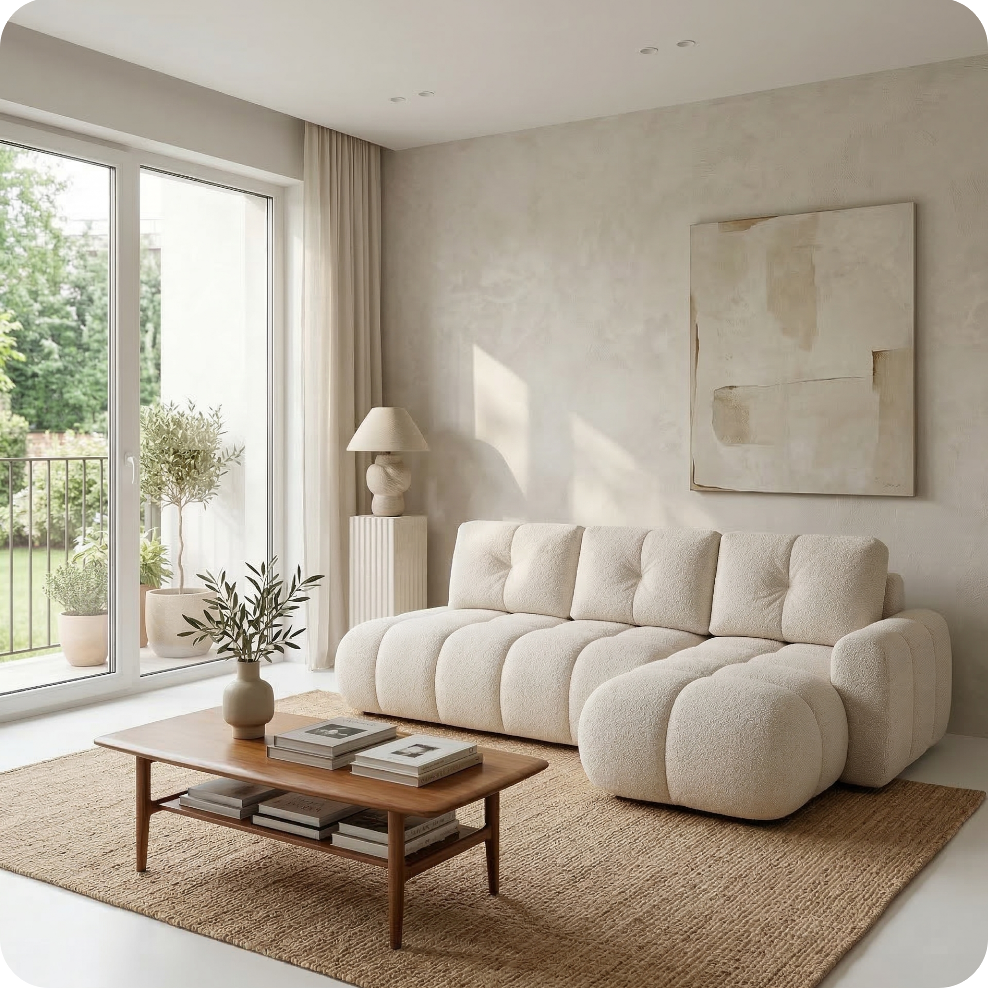
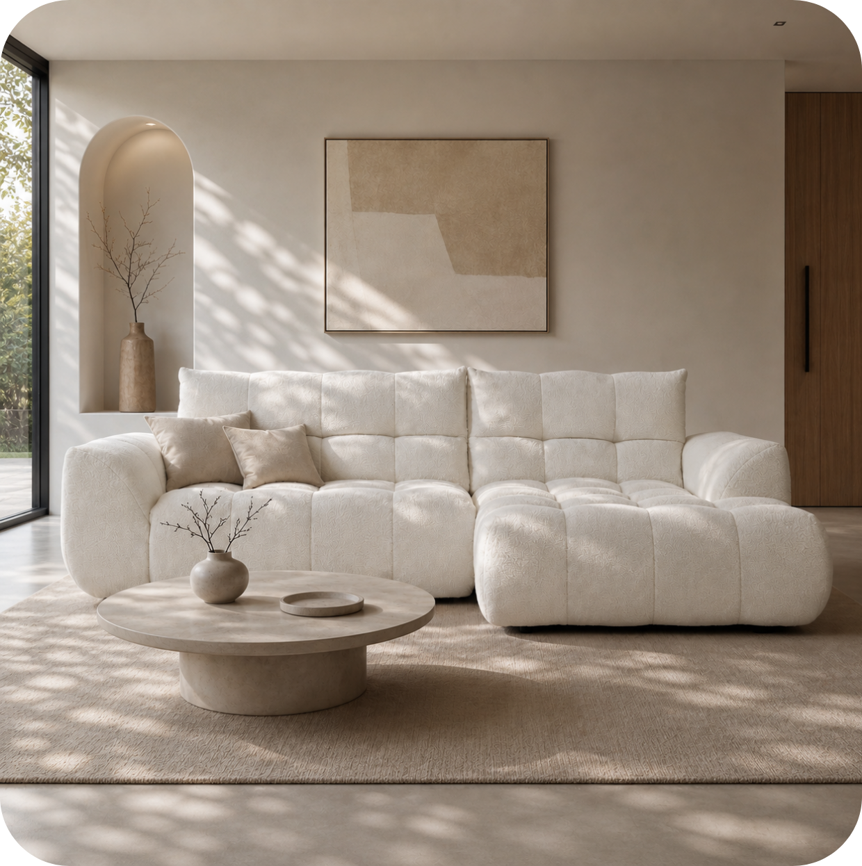
The biggest mistake people make with a neutral sofa is playing it too safe everywhere else too. If the sofa is cream, the rug is beige, the walls are off-white, and the cushions are also cream, the room reads as a study in safe avoidance rather than a considered palette. A neutral sofa needs contrast and colour to look intentional. One bold element — a deep terracotta feature wall, a richly patterned Moroccan rug, a set of deep forest green cushions, an oversized statement artwork — transforms a neutral sofa from forgettable to quietly confident. The sofa's neutrality provides the perfect background for that boldness to register.

Lugano Sofa in Sand — from EUR 1.290
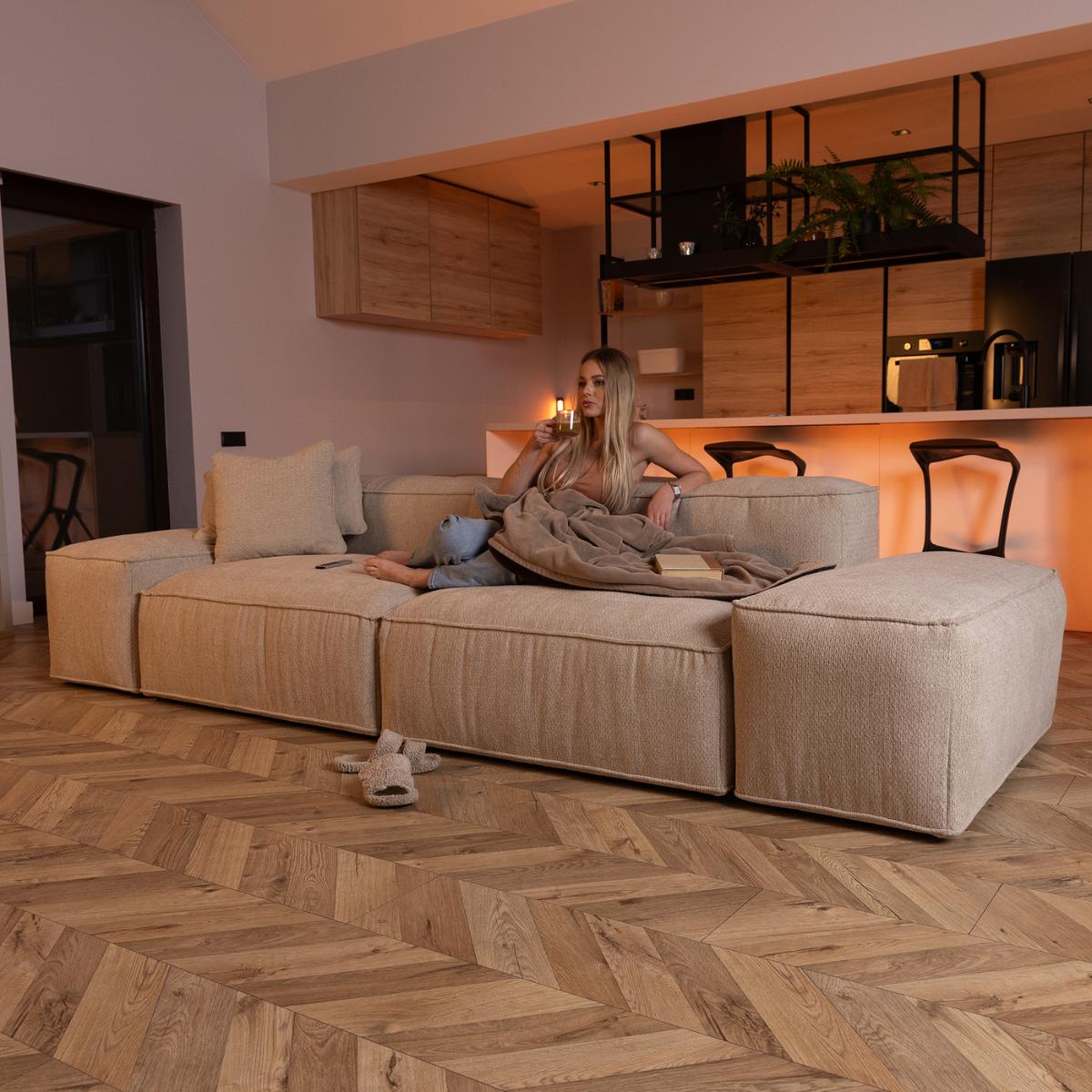
The Lugano in sand is the definition of considered neutrality: a warm, golden-toned sand that reads as natural rather than cold, and which works as a backdrop for virtually any colour direction. For a contemporary, on-trend living room, pair with a terracotta feature wall, deep green ceramic plant pots, rattan furniture accents, and cushions in warm terracotta, mustard, and cream. The Lugano's generous proportions and clean lines ensure the sofa itself is never boring — it is the foundation of the room, not a neutral afterthought.

Lugano Sofa in Light Grey — from EUR 1.290
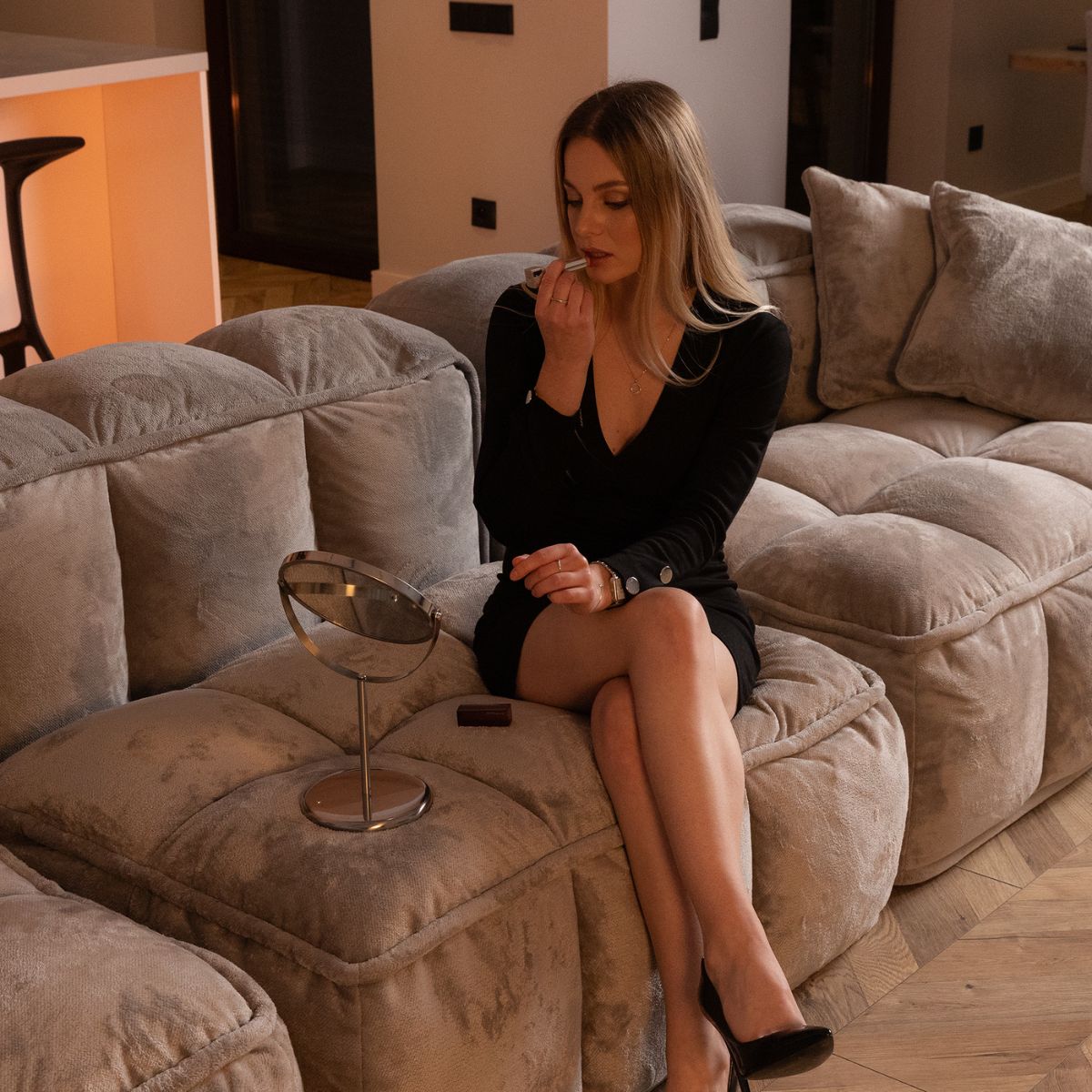
Light grey is the cooler counterpart to cream and beige — it has the same versatility but a slightly more contemporary, urban feel. The light grey Lugano works particularly well with navy blue accents (cushions, artwork), sage green, warm brass (table legs, lamp bases), and warm white walls. Unlike beige, grey has a natural partnership with deep, jewel tones — midnight blue, deep burgundy, forest green — that creates a more sophisticated and dramatic palette while still letting the sofa recede and the accents lead.
Colour Combinations that Elevate a Neutral Sofa
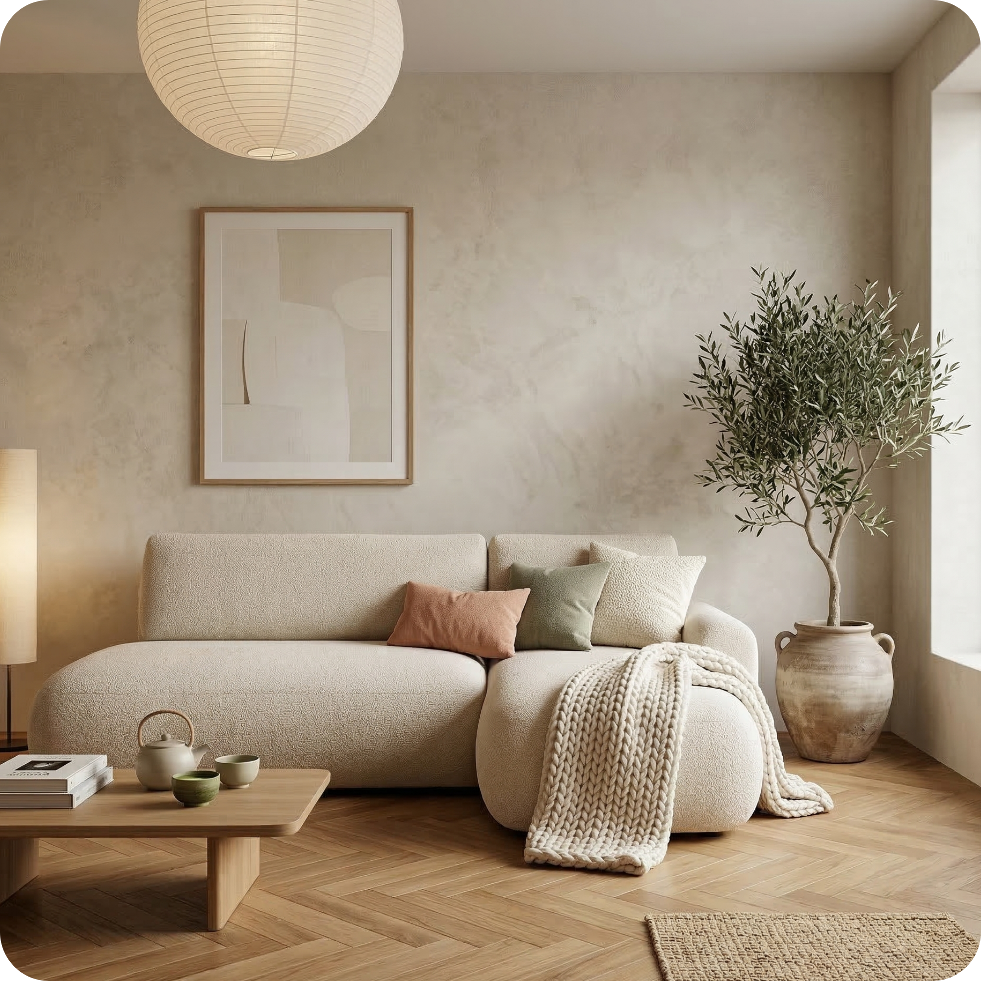
The warm earth palette — terracotta, burnt sienna, ochre, warm rust — is probably the most popular and photogenic combination with a cream or beige sofa, and for good reason: the warm tones amplify the warmth already in the neutral fabric, and the combination feels cohesive and seasonal. Navy blue against cream is a classic, timeless pairing that reads as sophisticated and controlled. Forest green or deep sage creates a botanical, organic feel that has been particularly prominent in interior design over recent years. Rich burgundy or deep plum adds drama and depth without departing from the warmth of the neutral palette. All of these combinations rely on the same principle: choosing a single accent colour direction and committing to it across cushions, accessories, and artwork, rather than mixing multiple unrelated accent colours.
Textural Interest: What Prevents a Neutral Sofa from Feeling Flat
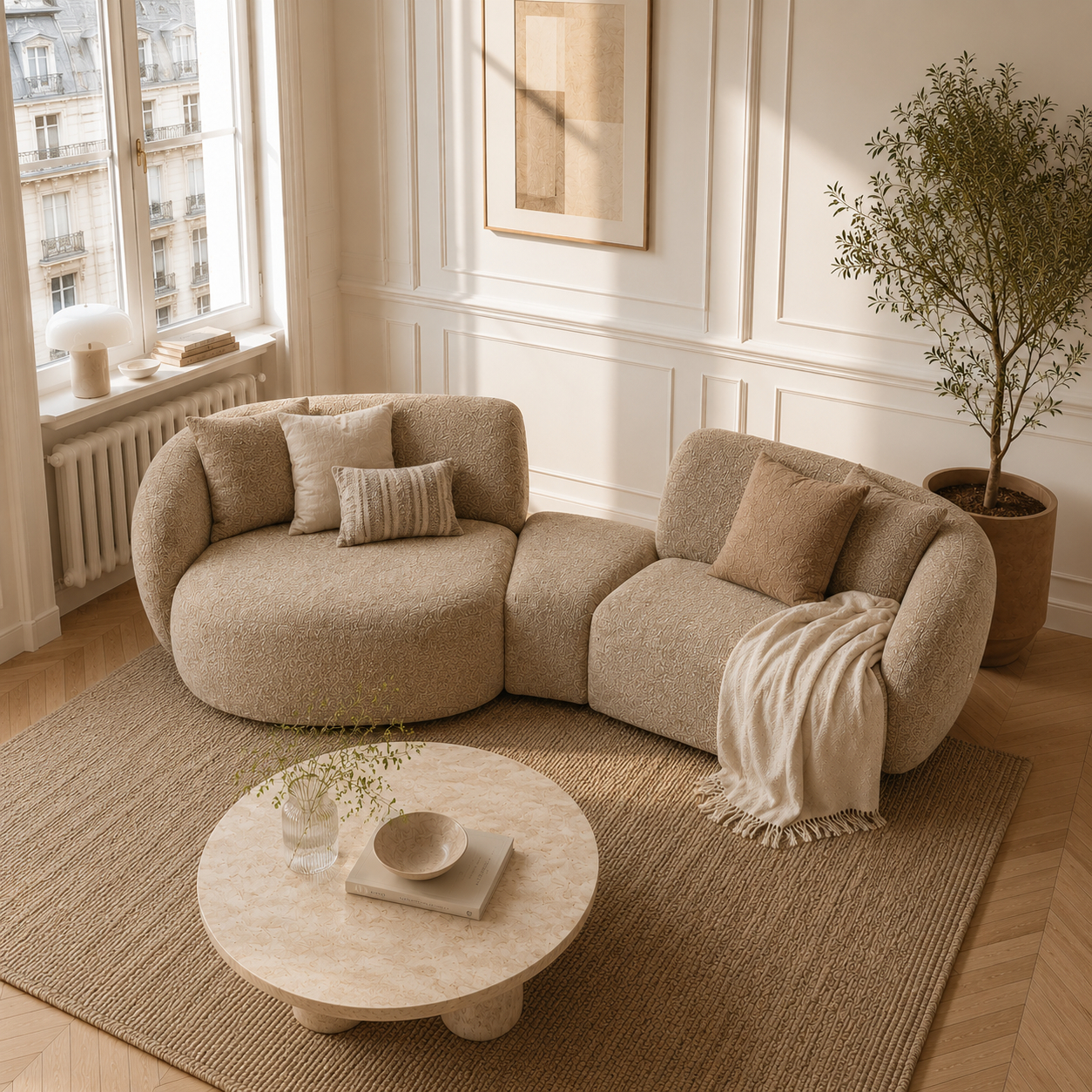
In a neutral living room, texture does the work that colour would do in a bolder scheme. When the palette is restrained, the room's visual interest comes from the variation of surface quality: the softness of linen, the roughness of jute, the warmth of wood grain, the polish of ceramic, the nap of velvet, the weave of rattan. Piling textural variation on a neutral sofa — a wool throw, velvet cushions, a linen bolster — adds richness and depth that the neutral palette alone cannot provide. The goal is a room that feels warm and layered rather than blank and minimal, achieved through material richness rather than colour saturation.

Zostaw komentarz
Ta strona jest chroniona przez hCaptcha i obowiązują na niej Polityka prywatności i Warunki korzystania z usługi serwisu hCaptcha.