


Warm vs Cool Interior Design Tones: Which Palette Is Right for Your Home?
One of the most common mistakes in interior design is mixing warm and cool tones without intention. The result is a room that feels somehow off — not obviously wrong, but lacking coherence, as if the furniture and walls are slightly disagreeing with each other. Understanding the difference between warm and cool tones, and knowing when to use each, is one of the most practical skills you can develop for decorating your home.
What Are Warm Tones?
Warm tones are colours that contain yellow, orange, or red undertones. In interior design, warm colours include terracotta, rust, ochre, caramel, cream, off-white with yellow or pink undertones, warm wood browns, olive green, and warm grey (grey with a brown or yellow undertone rather than blue). Warm tones create rooms that feel inviting, intimate, and energising. They work particularly well in spaces used for socialising, dining, and activities that benefit from a stimulating atmosphere. They are also the traditional choice for north-facing rooms, which receive cool, blue-toned natural light — the warm palette counteracts that coolness.
What Are Cool Tones?
Cool tones contain blue, green, or purple undertones. In interior design, cool colours include slate blue, sage green, lavender, cool grey (grey with a blue or green undertone), bright white, and most blues and greens. Cool tones create rooms that feel calm, spacious, and serene. They work particularly well in bedrooms, bathrooms, and spaces used for reading, concentration, and activities that benefit from a calmer atmosphere. Cool palettes are also traditional in south-facing rooms, which receive warm, golden-toned natural light — the cool palette balances that warmth.
The Undertone Problem with Sofas and Walls
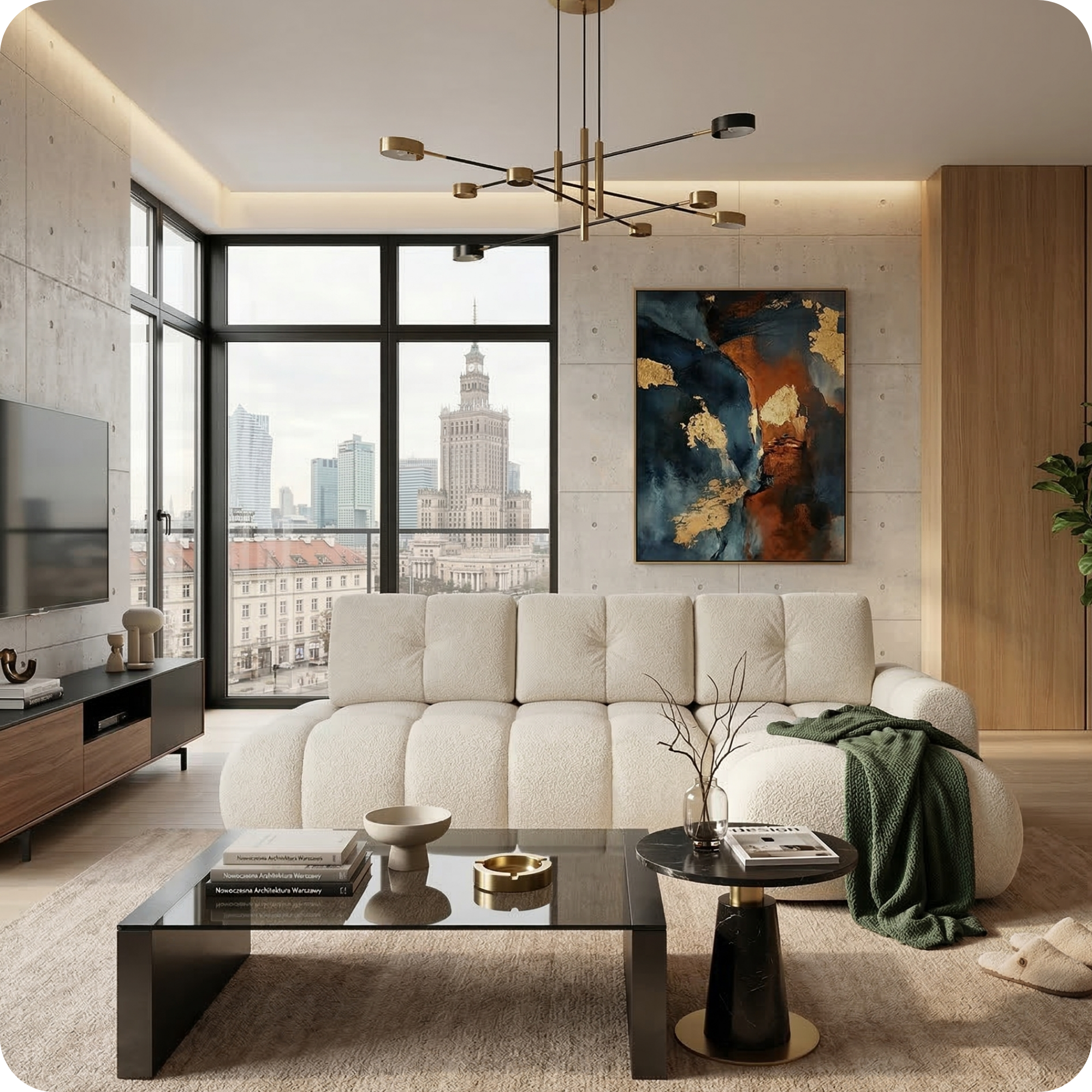
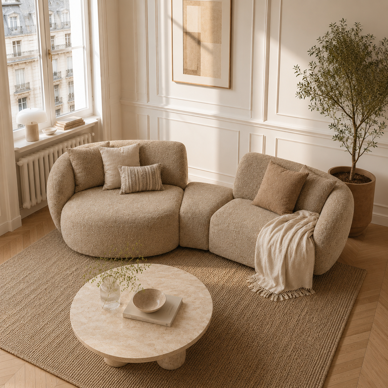
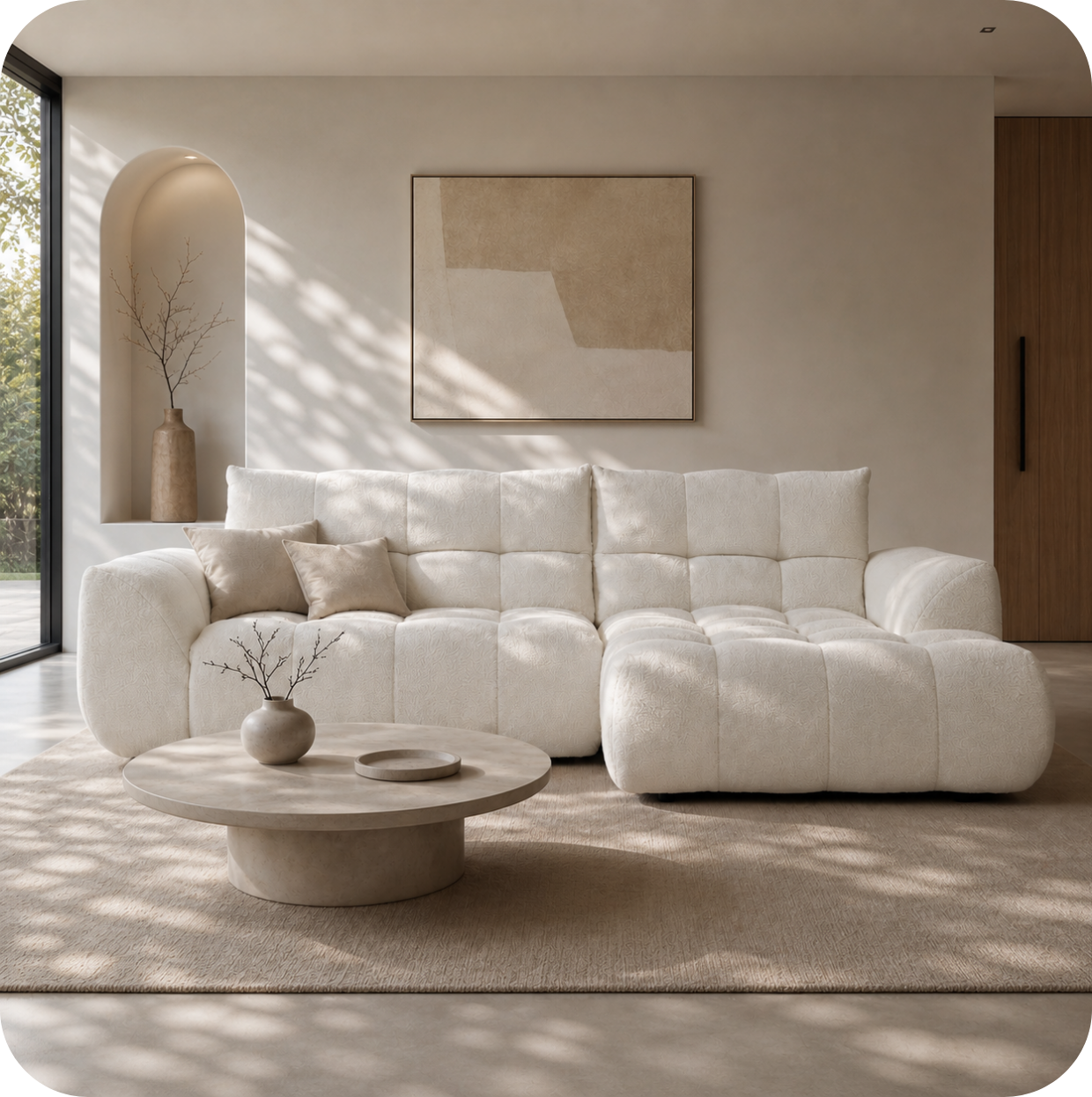
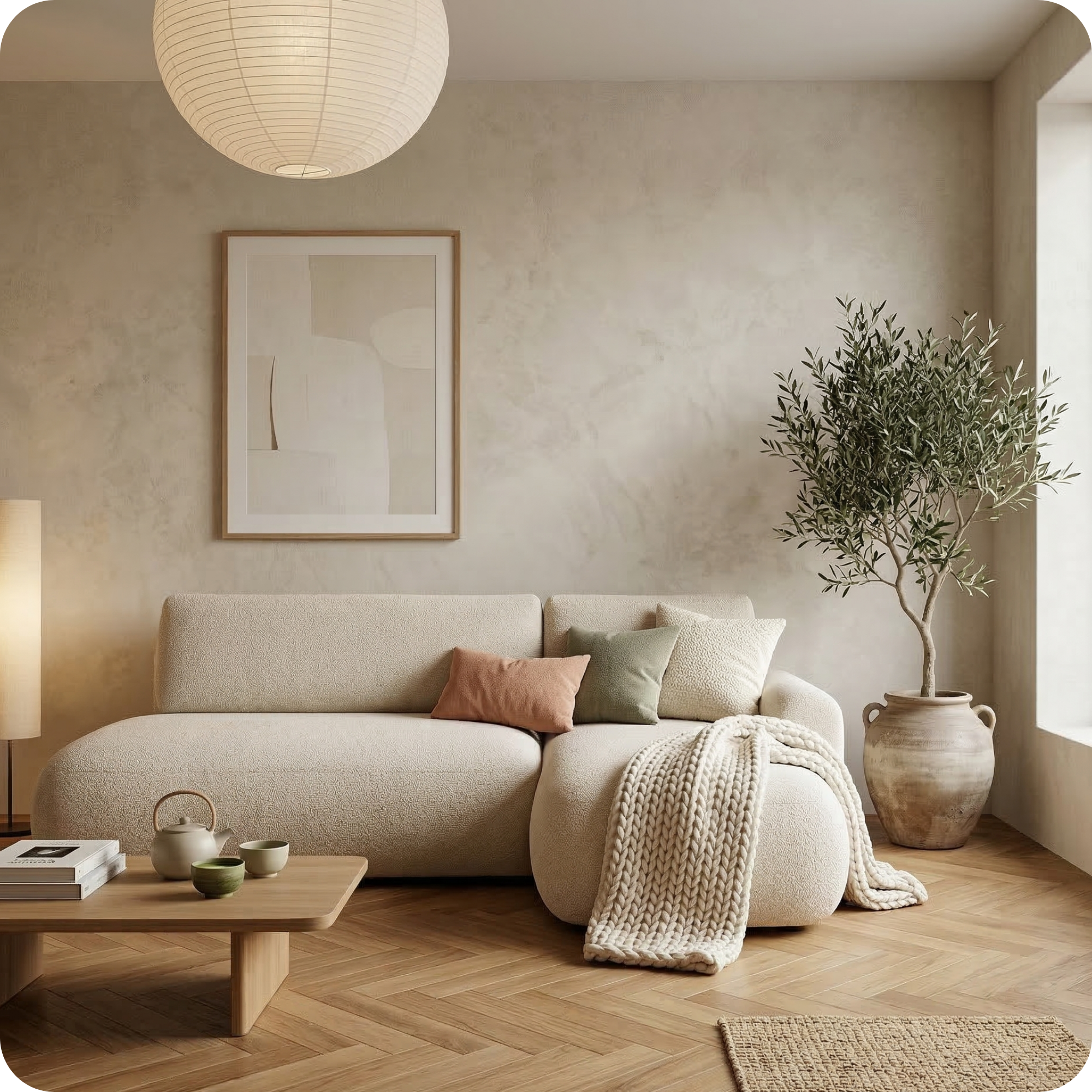
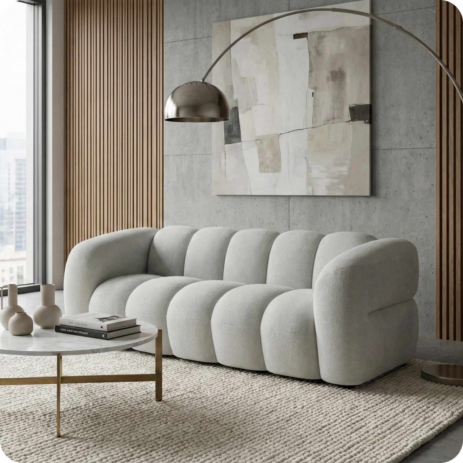
The most common undertone clash in living rooms happens between the wall colour and the sofa. A sofa upholstered in a fabric with warm undertones — even a nominally neutral beige or grey — will look mismatched against a wall painted in a cool grey or blue-grey. The sofa will appear to have an unflattering yellowish cast against the cool wall, or the wall will appear harsh and clinical against the warm sofa. The solution is to ensure the sofa and wall are in the same temperature family — both warm or both cool.

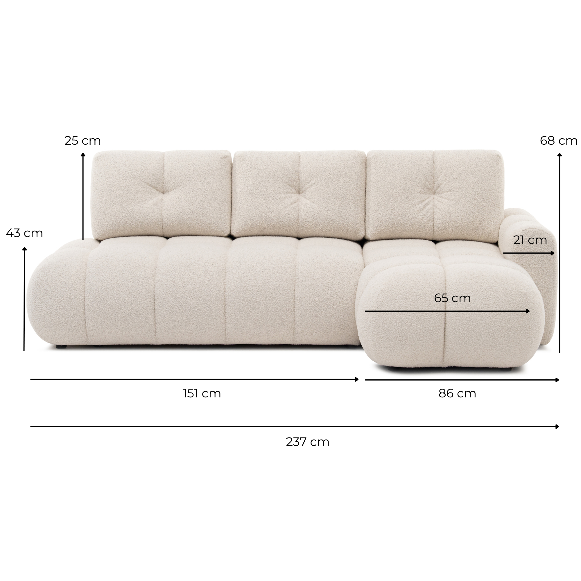
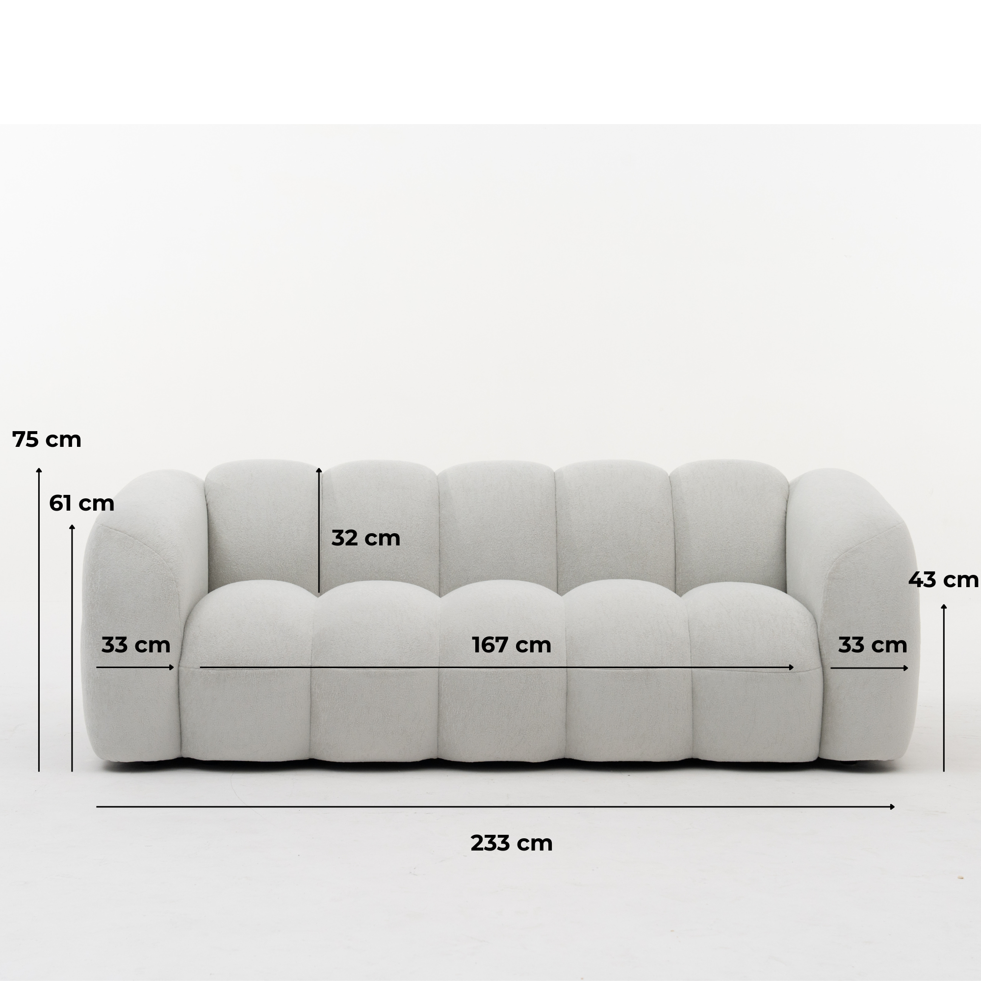
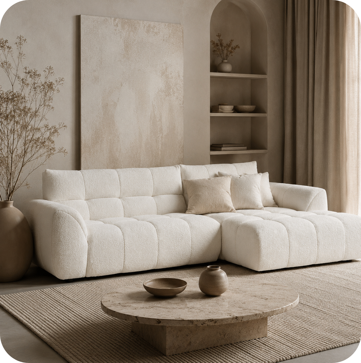
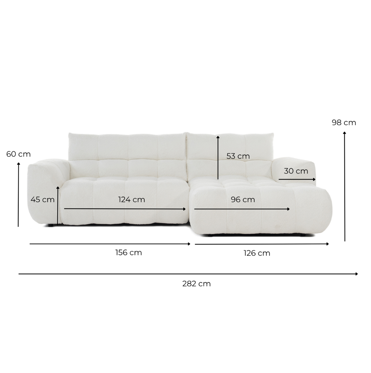
Lugano Sofa Collection — from €1,299
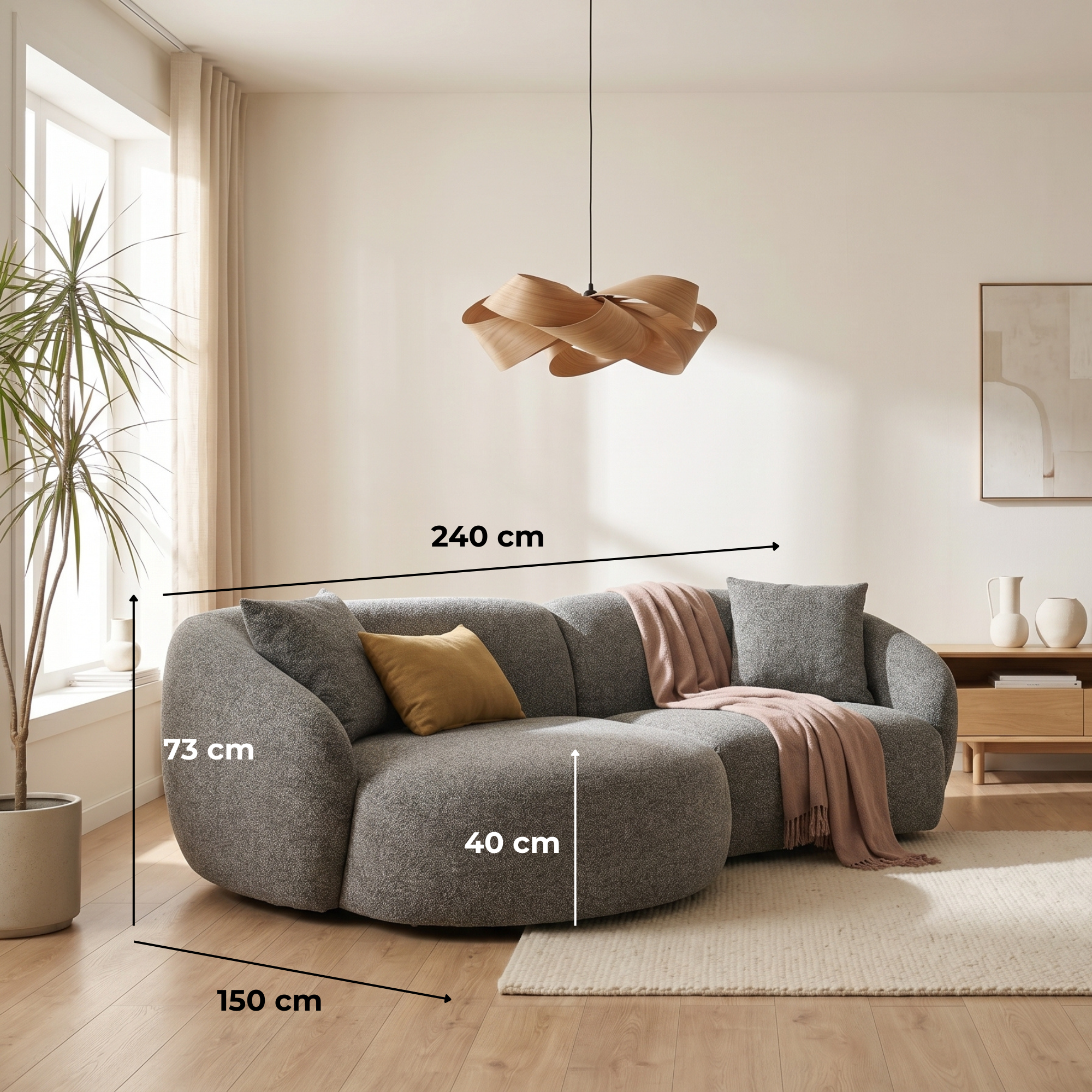
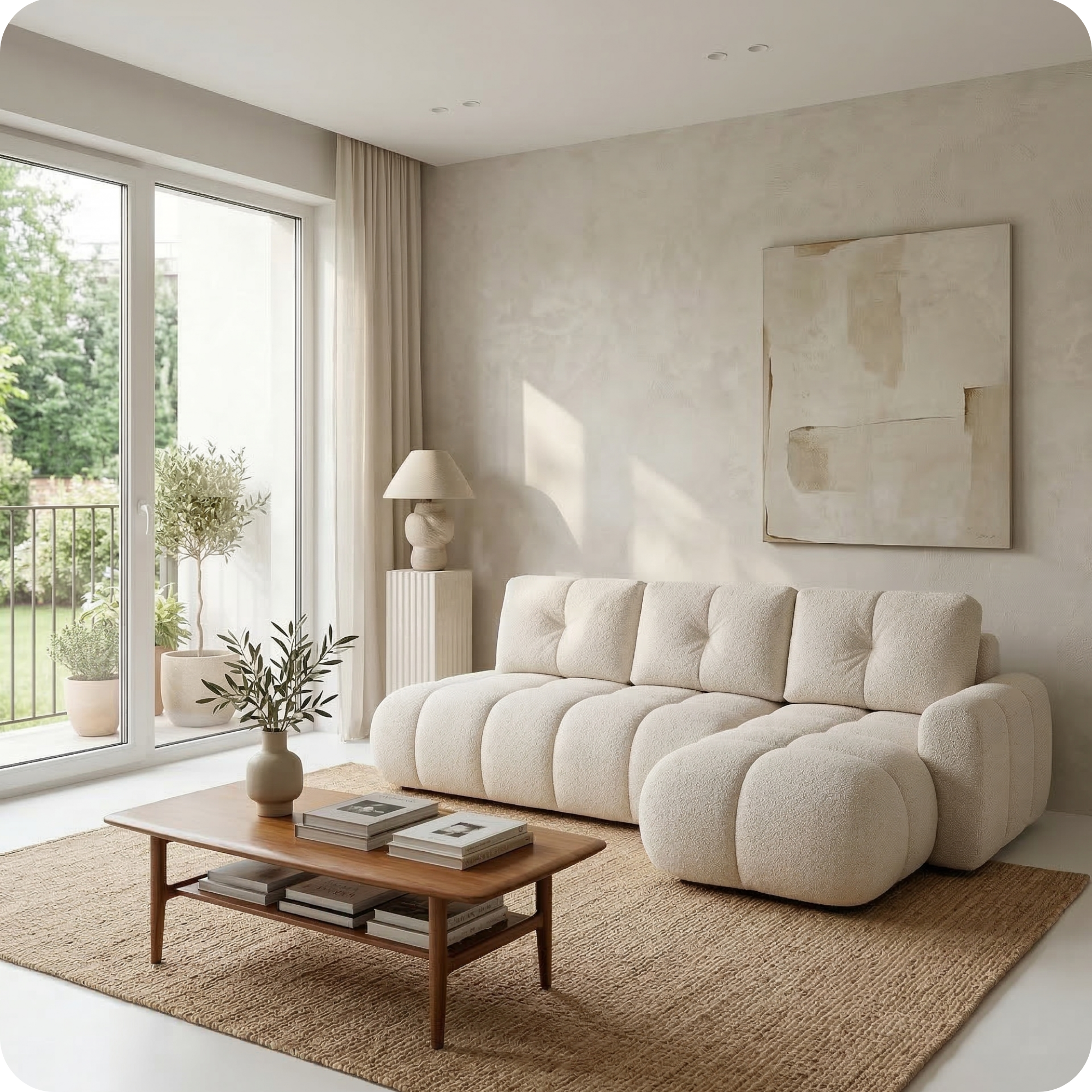
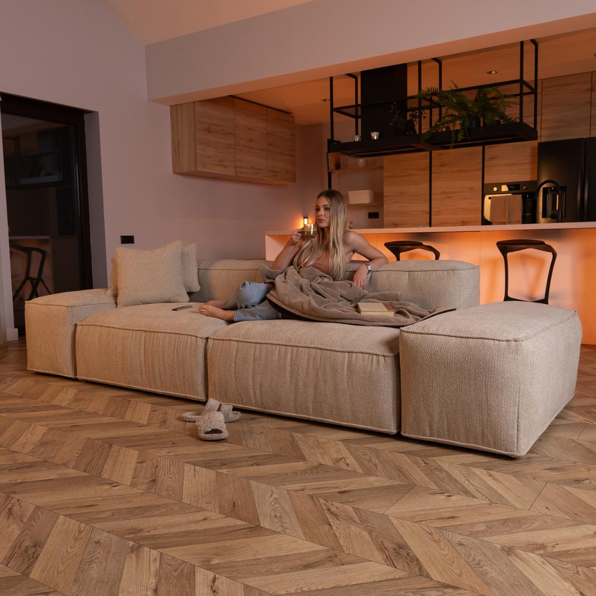
The Lugano collection is available in a range of tones from cool light grey through warm sand and khaki. When selecting your Lugano, consider the temperature of your existing room: if your walls, floor, and existing furniture lean warm, a warm Lugano tone (sand, khaki, toffee) will integrate seamlessly; if they lean cool, a cool light grey will feel more at home. Our team can advise on specific fabric matches for your room.

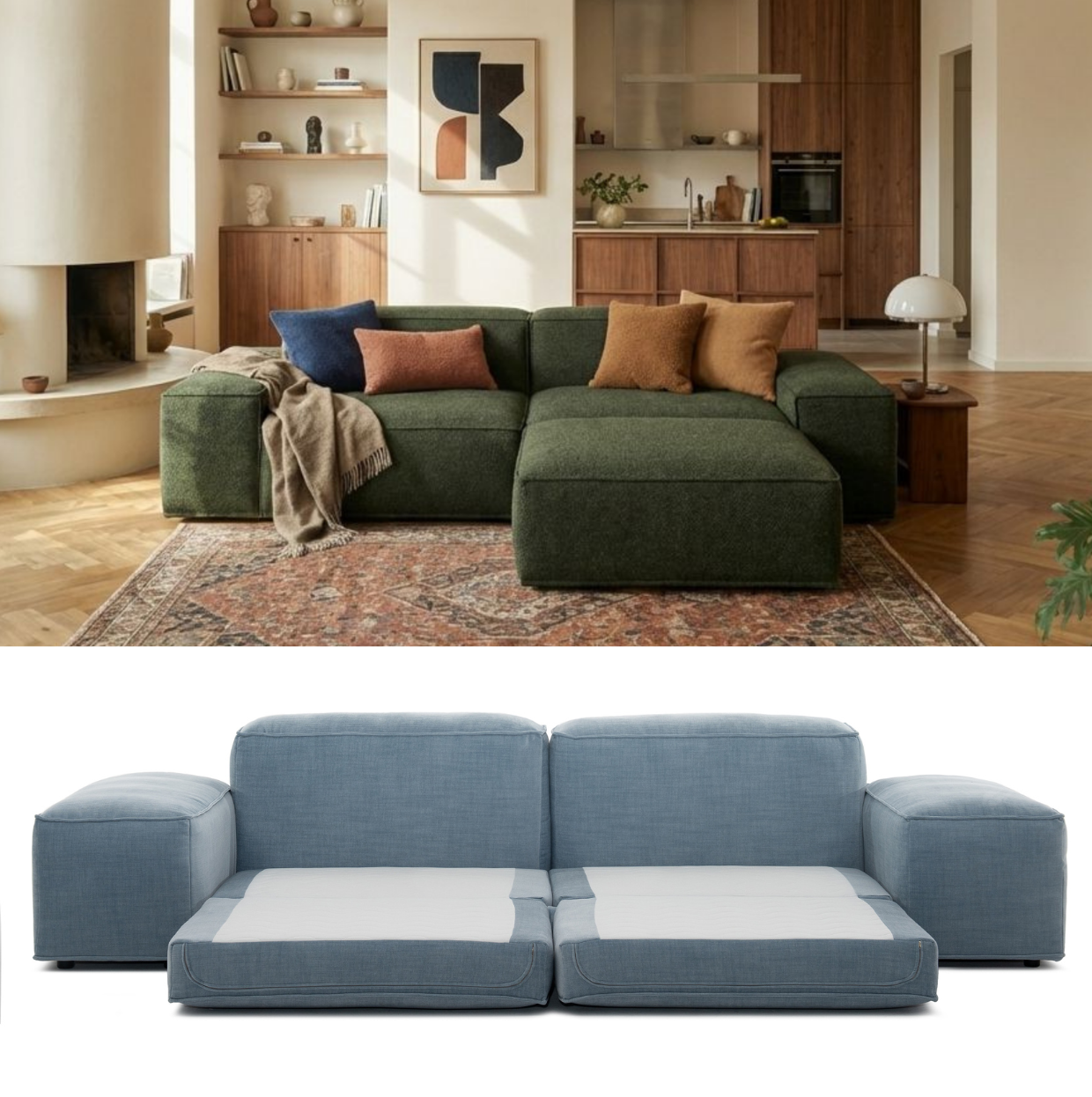
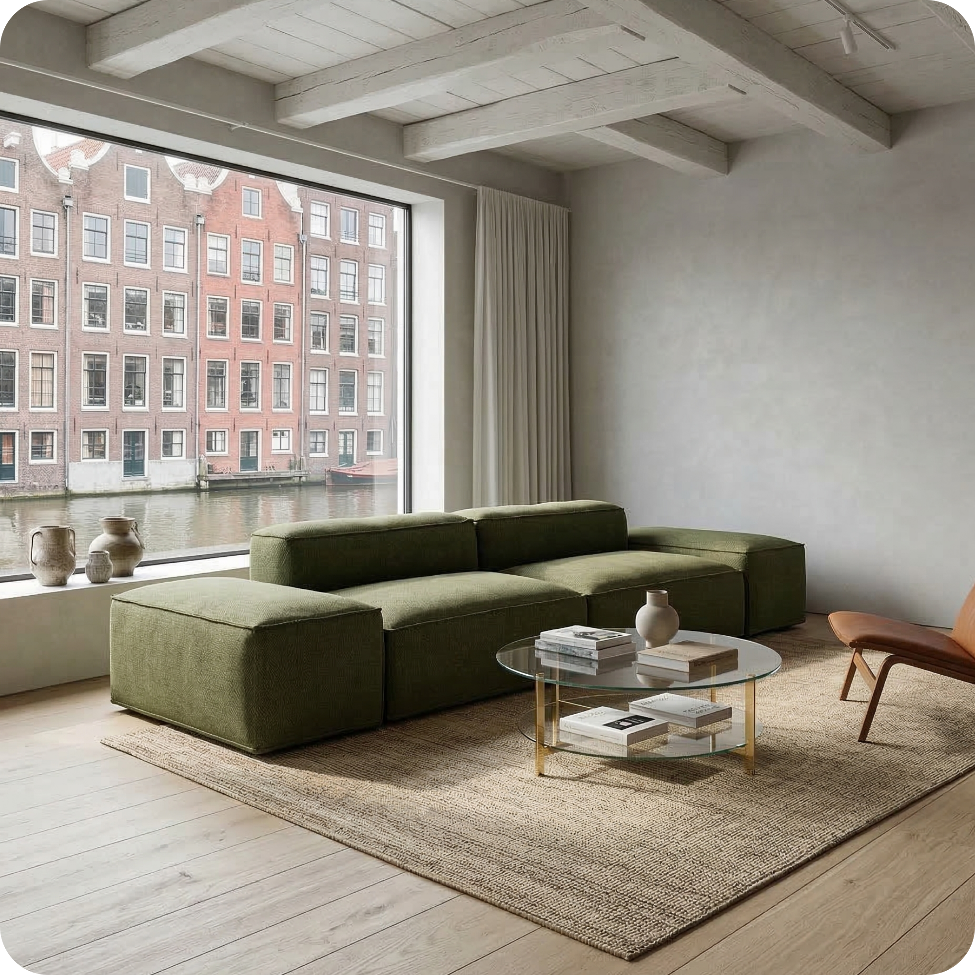
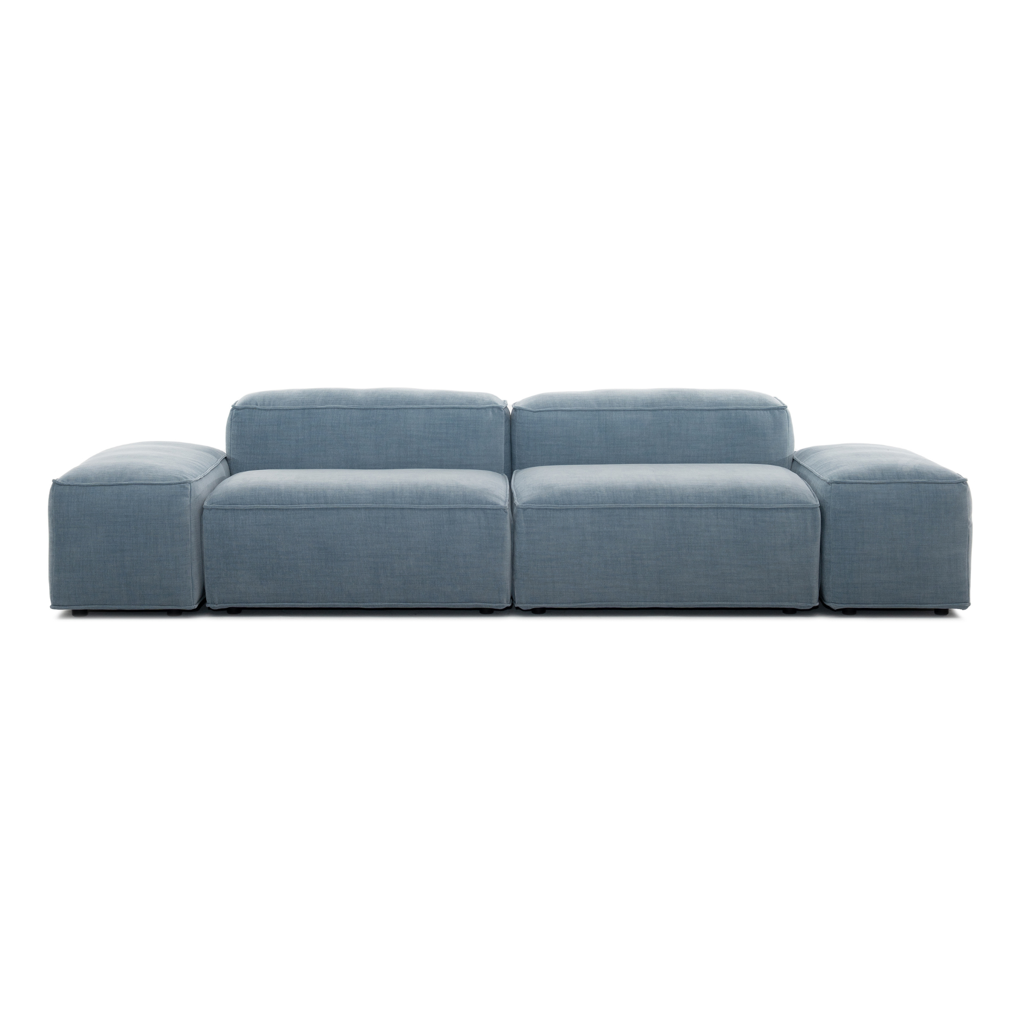
Merlot Modular Sofa — from €1,532
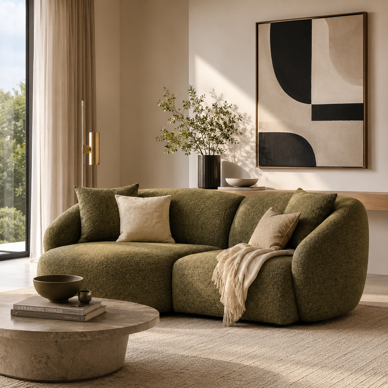
The Merlot modular sofa is available in the leaf green shown here as well as other tones. The leaf green has a warm undertone — it pairs naturally with warm ochre, terracotta, and natural wood. For a cooler-toned room, the Merlot is also available in tones with blue-based undertones that work with cool palettes built around slate, stone, and blue-grey.
How to Read a Room's Temperature
Before choosing any new furniture or decor, read your room's existing temperature. Stand in the room during the day and look at the walls: do they appear warm (yellowish, peachy, pinkish) or cool (bluish, greenish, grey)? Look at the floor: is it a warm wood brown, a cool grey stone, or a neutral oak? Look at any existing furniture: do the finishes lean warm (honey, caramel, dark walnut) or cool (white, silver, slate)? If the room has a clear temperature tendency, go with it. Working against the room's natural temperature requires a very deliberate and complete palette switch — half-measures create the mismatched feeling described at the start of this guide.
When to Mix Warm and Cool
Warm and cool tones can be mixed intentionally to great effect, but only when there's a clear dominant temperature and the opposite temperature is used as an accent. A predominantly warm room (terracotta walls, warm wood floor, caramel sofa) can accommodate cool accents — a grey-blue vase, a slate-coloured lamp — without losing its warm character, because the cool elements are clearly secondary. The mistake is attempting a 50/50 split, or adding cool elements without a clear intention behind them.
Warm and Cool Neutrals: The Trickiest Category
The most confusing category for most people is warm and cool neutrals — the greys, whites, and beiges that appear to be neutral but in fact contain strong undertones. Choosing a warm grey sofa and a cool grey wall will create an obvious clash that's hard to identify without understanding undertones. When buying any neutral — whether for walls, floors, or furniture — always check the undertone: hold a warm white paint card and a cool white paint card next to each other and the difference will be immediately apparent. Repeat this exercise for every neutral purchase.